Milliron DDS & Associates
Impact Study.
A system-level website transformation grounded in restraint, judgment, and operational clarity
This Impact Study examines how a long-standing dental practice modernized its digital presence without disrupting patient trust, staff workflows, or day-to-day operations. Rather than applying visible UX ceremony, the work focused on restructuring information, clarifying care pathways, and reducing friction across patient and staff interactions.By translating UX rigor directly into implemented structure—navigation, hierarchy, and task prioritization—the engagement improved clarity and usability while respecting the practice’s culture, pace, and clinical reality.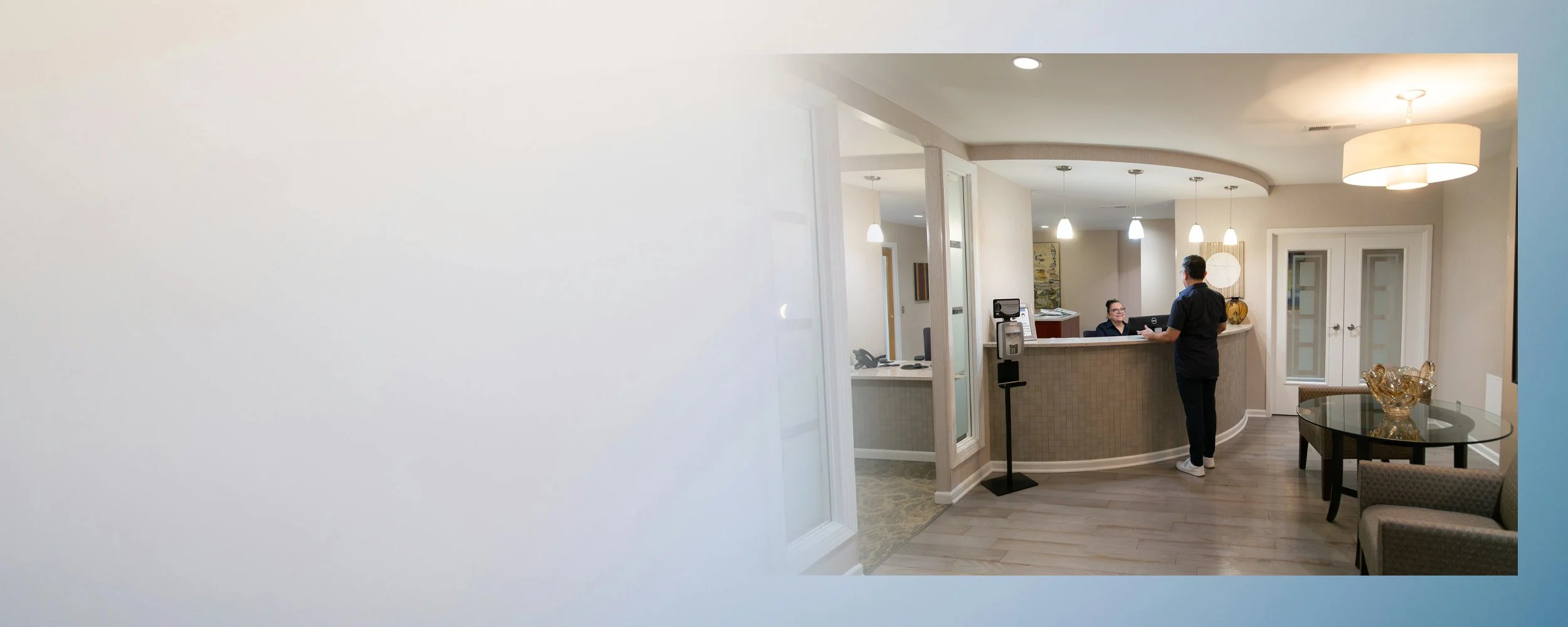
PRJ-003, Operational Impact, +/− Quantified
Impact modeled through structural reduction in task depth and navigation complexity
Quiet UX for a High-Trust Clinical Practice
Reduced decision depth in high-frequency patient flowsSimplified navigation, care hierarchy across core tasksOffloaded routine informational labor from staff to system structureIncreased clarity of care pathways without operational expansion
INHERITED STRUCTURE & DAILY CONSEQUENCE
Modernizing a Legacy Practice Without Disruption.
Milliron DDS & Associates is a long-established dental practice in Washington, D.C., serving a multigenerational patient base with diverse clinical needs. Over many years, the website grew incrementally; services added, pages layered, content expanded, personnel departure—without a governing structure to manage hierarchy, flow, or priority.
Day to day, this accumulation had real consequences. Staff routinely spent time on the phone answering questions about forms, insurance, office hours, and emergency care, issues the site technically covered, but not in ways patients could reliably navigate.
The engagement was framed as a website refresh. In practice, it was a structural correction, executed under clear constraints: a small internal team, limited appetite for abstraction, and a strong preference for pragmatism over process visibility.
Constraint was not incidental. Constraint shaped every decision.

ENCODED PRIORITIES & DECISION WEIGHT
Right-Sizing the Method
This was not an environment suited to highly visible UX methodology. Formal research readouts, exhaustive persona decks, or prolonged workshops would have introduced friction rather than clarity.
The site functioned as a system of decisions, not just screens. For example:
Insurance information, emergency guidance, and cosmetic services were presented with equal visual weight—forcing patients to interpret urgency on their own.
Critical tasks like payment and forms existed, but were buried in PDFs multiple clicks deep, while less time-sensitive service pages dominated navigation.
The work therefore centered on:
Understanding how decisions were implicitly encoded in structure
Identifying where hierarchy—not content—was breaking down
Translating UX rigor directly into structural change
The goal was not to display UX.
It was to make the system legible.
MULTI-USER REALITY INSIDE A SINGLE INTERFACE
Patients and Staff Sharing One Interface
Although the site appeared patient-facing, it served three interconnected user groups:
Returning Patients: Needing fast access to forms, payment, hours, and familiar terminology.
Office Staff: Dependent on the site to absorb routine questions and reduce operational drag.
New Patients: Seeking reassurance, clarity, and reduced anxiety before first contact.
Because the practice serves patients across a wide age range, clarity, legibility, and reduced cognitive load were not preferences—they were necessities.
When hierarchy failed, patients compensated cognitively and staff compensated operationally.
Stakeholder →
Returning PatientOffice StaffNew Patient
Friction →
Desire for predictabilityHidden payment linkForms confusionUnclear contact infoFear of looking incompetent
Structural Response
Clarified homepage priorities to reduce decision frictionBuild trust through “know before you go” UXPrioritize utility: pay, forms, contactEliminate confusion with clear, calm contentAligned layout and styling to minimize perceived instability
Method Shift: Observation Over Artifact
When traditional research artifacts failed to gain traction, the approach shifted toward live process observation embedded within day-to-day operations. Rather than positioning the session as a formal interview, the engagement took the form of a collaborative walkthrough—surfacing decision logic, task friction, and language patterns in real time.
ACCUMULATED CONTENT & SIGNAL DILUTION
Content Audit as a Decision Tool
A full audit of the legacy site revealed consistent patterns:
Large blocks of near-identical copy repeated across service pages
Navigation functioning as a sitemap rather than a pathway
Critical tasks present but not prioritized
Calls-to-action competing globally, regardless of intent
The audit clarified which information actually influenced patient decisions—and which content existed simply because it always had.
The issue was not lack of information. It was lack of signal.
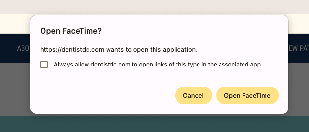
In addition to hierarchy issues, the site encoded an access pathway that did not reflect operational reality. A FaceTime call-to-action was presented as a contact option, implying real-time, camera-ready interaction. In practice, patients did not initiate impromptu video calls, and the administrative team was not staffed to receive unscheduled live requests.
The friction was not visual. It was structural: a channel introduced without alignment to actual patient behavior or internal workflow. The feature signaled access, but did not support it.
Access Pathways That Failed in Practice
Structured Through Restraint
Rather than exposing the full analytical apparatus, insights were embedded directly into structure. Every change was evaluated against a single question. Does this reduce friction without increasing explanation?


Clarity as Clinical Trust
Accessibility was approached as basic usability, not compliance theater. Clear hierarchy, readable contrast, thoughtful spacing, and predictable interactions were treated as expressions of care. In a healthcare setting serving patients of different ages and comfort levels with technology, clarity is not aesthetic polish—it is reassurance.
In this context, accessibility gaps were not minor technical oversights. They created confusion, slowed understanding, and subtly signaled disorganization. In a clinical environment, that kind of friction weakens trust.
SELECTIVE EXPOSURE OF METHOD
Knowing What Not to Surface
Internal flow diagrams, content models, and hierarchy maps guided decisions throughout the project—but were not presented as client deliverables. Instead, insights were translated directly into CMS-ready navigation updates, page-level restructuring, and implemented outcomes.
Restraint here was not a reduction of rigor. It was an application of UX maturity.
System Absortion of Operation Load
The final site delivers:
Clearer care pathways
Reduced cognitive burden for patients
Fewer routine questions for staff
Staff reported fewer calls about forms, hours, and logistics. New patients arrived more prepared, with clearer expectations. The site began carrying work that previously fell to people.
Maturity Without Theatre
When UX Maturity Means Stepping Back.
Milliron DDS illustrates a quieter form of UX leadership. In environments where ceremony would create friction, effectiveness comes from judgment—knowing when to translate rigor, when to withhold it, and when to let the experience speak plainly.
Sometimes the most responsible design decision is restraint.
Future Opportunities & Governance
Preserving Clarity Over Time
This project revealed a different kind of leverage: not scale, but consistency.
Because the redesign prioritized structural correction over brand overhaul, its long-term durability depends on preserving the same discipline in future updates. While the visible outcome appears streamlined, the restructuring was informed by extensive backend analysis—content audits, comparative review, user flows, sitemap reconstruction, empathy mapping, and strategy synthesis. The restraint presented externally was supported by substantive diagnostic work internally.
In small clinical environments, websites often erode gradually through well-intentioned additions, duplicated content, and urgent updates that accumulate without structural oversight. The risk is not dramatic change, but slow drift away from coherence. Protecting clarity requires continued adherence to the underlying structure that made the redesign possible.
The opportunity is governance through simplicity:
Additions that follow established hierarchy
Content updates that preserve sequencing and brevity
Technical adjustments that do not introduce new friction
The takeaway is not about expanding process. It is about protecting structure. In a high-trust healthcare environment, clarity is not a launch milestone—it is an ongoing discipline.