Flint Hill
Impact Study.
A mobile decision-architecture evaluation
This Impact Study summarizes the outcomes of a focused mobile-first evaluation of Flint Hill’s admissions experience, highlighting where structural friction introduced measurable risk, and how a systems-level approach clarifies the path forward.
PRJ – 001, Admissions Impact, Diagnostic Impact Quantified
Metrics reflect observed interaction behavior and diagnostic system analysis
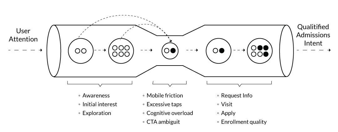
Admissions Friction, Decision Latency, & Lost Momentum
Critical blockers identified across core decision paths:
Observed interaction failures (P0/P1 severity)
Parallel journeys converging on the same objectives: Diagnostic findings across entire systemReduced interaction unlocks faster progression to intent: Improvements reduced paths and time-to-task completion
STRATEGY IMPACT
Beyond identifying usability issues, the evaluation surfaced a broader strategic opportunity: to treat admissions as a unified decision system rather than a set of isolated pages.
The evaluation provided Flint Hill with its first mobile admissions architecture, positioning the school to reduce UX debt, improve inquiry pipeline health, and unify Request Info, Visit, and Apply into a coherent high-intent flow. By identifying systemic issues rather than page-level ones, the work established a durable foundation for governance, future content strategy, and long-term admissions scalability.
ECOSYSTEM CONTEXT
To ensure focus and relevance, the evaluation was intentionally scoped to the moments where prospective families make critical decisions on mobile.
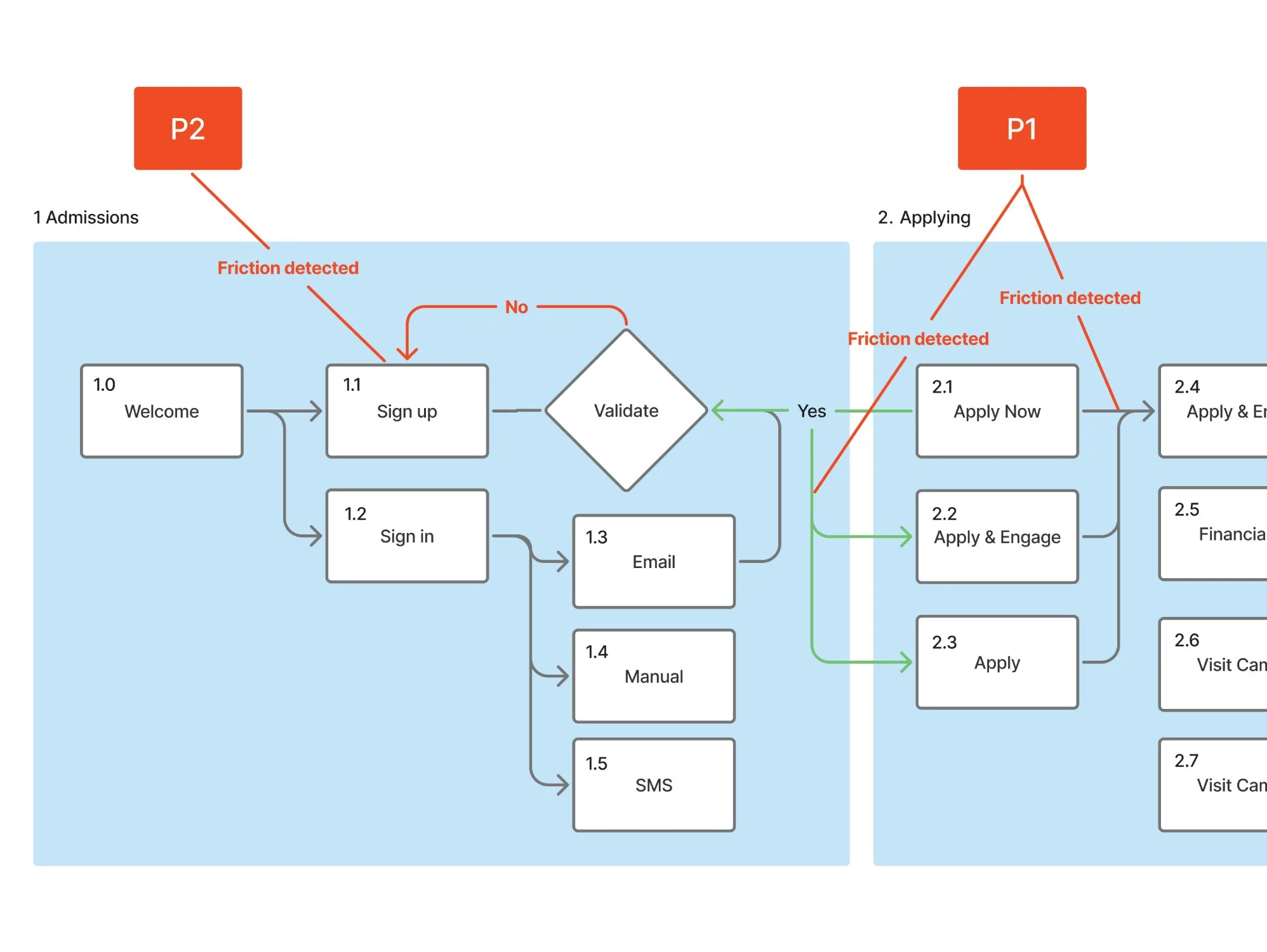
Flint Hill requested a focused mobile evaluation of four SOW-defined admissions pages—Admissions, Request Info, Visit, Apply—to understand friction at key decision points. The broader ecosystem was not in scope; however, Madeira and Potomac were reviewed as competitive structural benchmarks to contextualize hierarchy, CTA weighting, and admissions sequencing.
Systems-Level Diagnostic Approach
With scope defined, the work applied a systems-level diagnostic approach designed to surface root causes rather than isolated page defects.
I conducted a mobile-first evaluation applying a diagnostic framework to surface systemic friction patterns across four admissions-critical pages, rather than treating issues as isolated page-level defects. Each method contributed a distinct lens—spanning usability principles, behavioral thresholds, journey sequencing, and competitive context—to identify where and why the admissions experience broke down on mobile. While the review was scoped to a subset of the broader IA, repeated friction patterns across these key decision points enabled confident prioritization of P0/P1 risks and informed architectural recommendations grounded in user behavior, not surface-level design critique.
-

LENS →
-

SEVERITY →
-

SYNTHESIS →
-

COGNITION →
-

FLOW →
-

FEEDBACK
The Core Problem
When examined through this diagnostic lens, a consistent pattern emerged across all four admissions-critical flows. The four pages showed high mobile friction, creating a P0-level risk of prospective families abandoning the admissions journey before reaching inquiry. Key issues included:
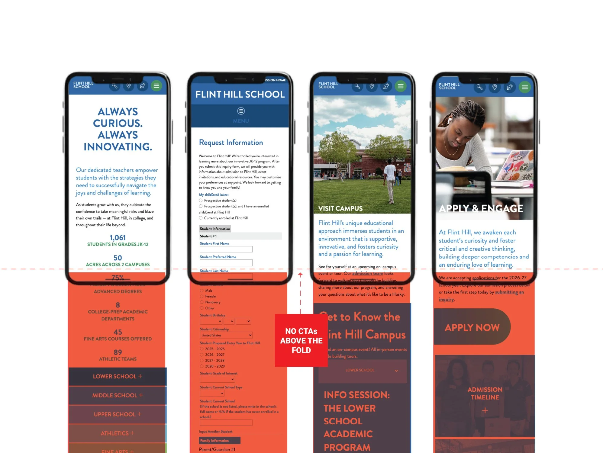
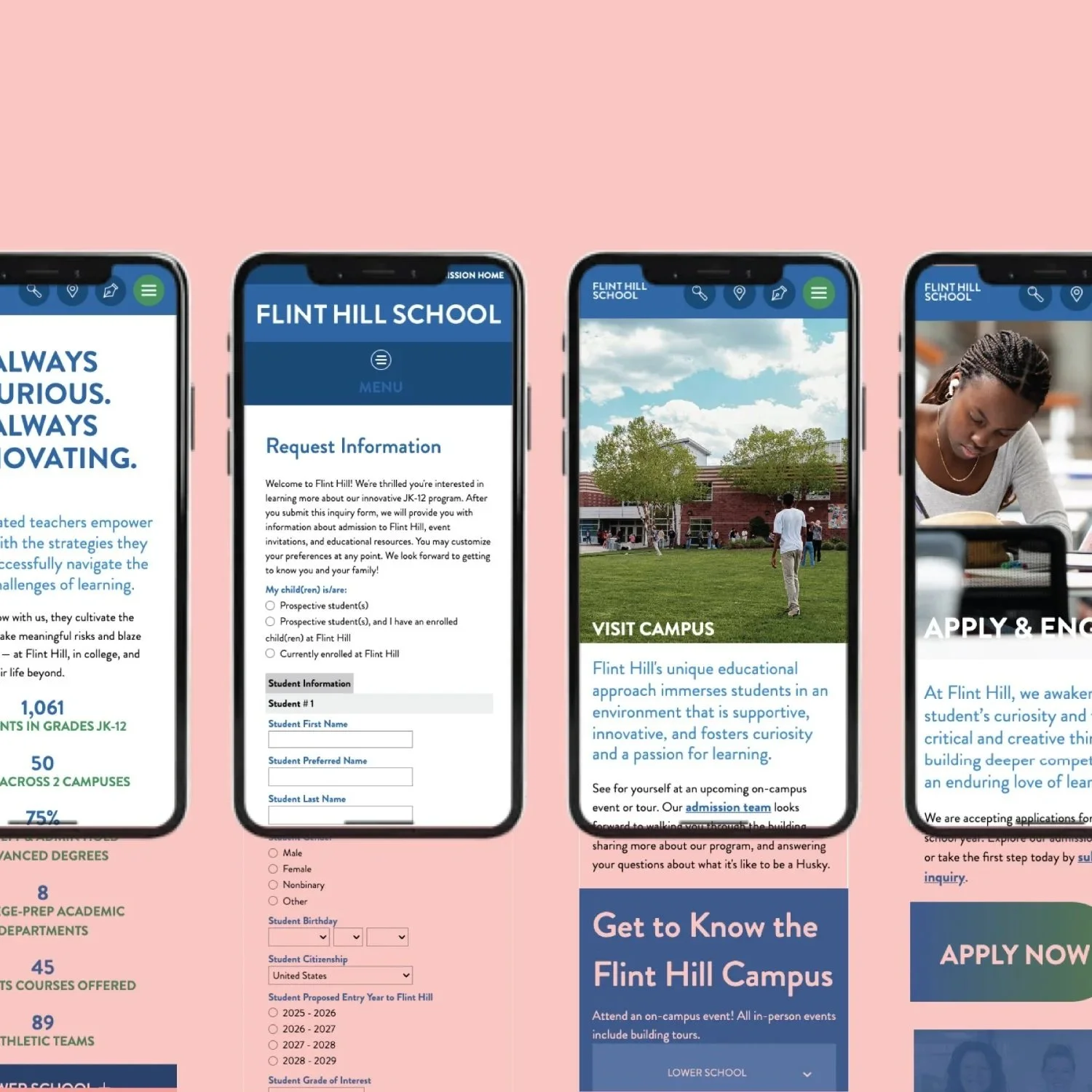
Critical CTAs Below the Fold
Key CTAs pushed below 50vh, lowering discoverability. This initial friction contributes significantly to the typical 53% mobile website abandonment rate when key actions are hard to find.
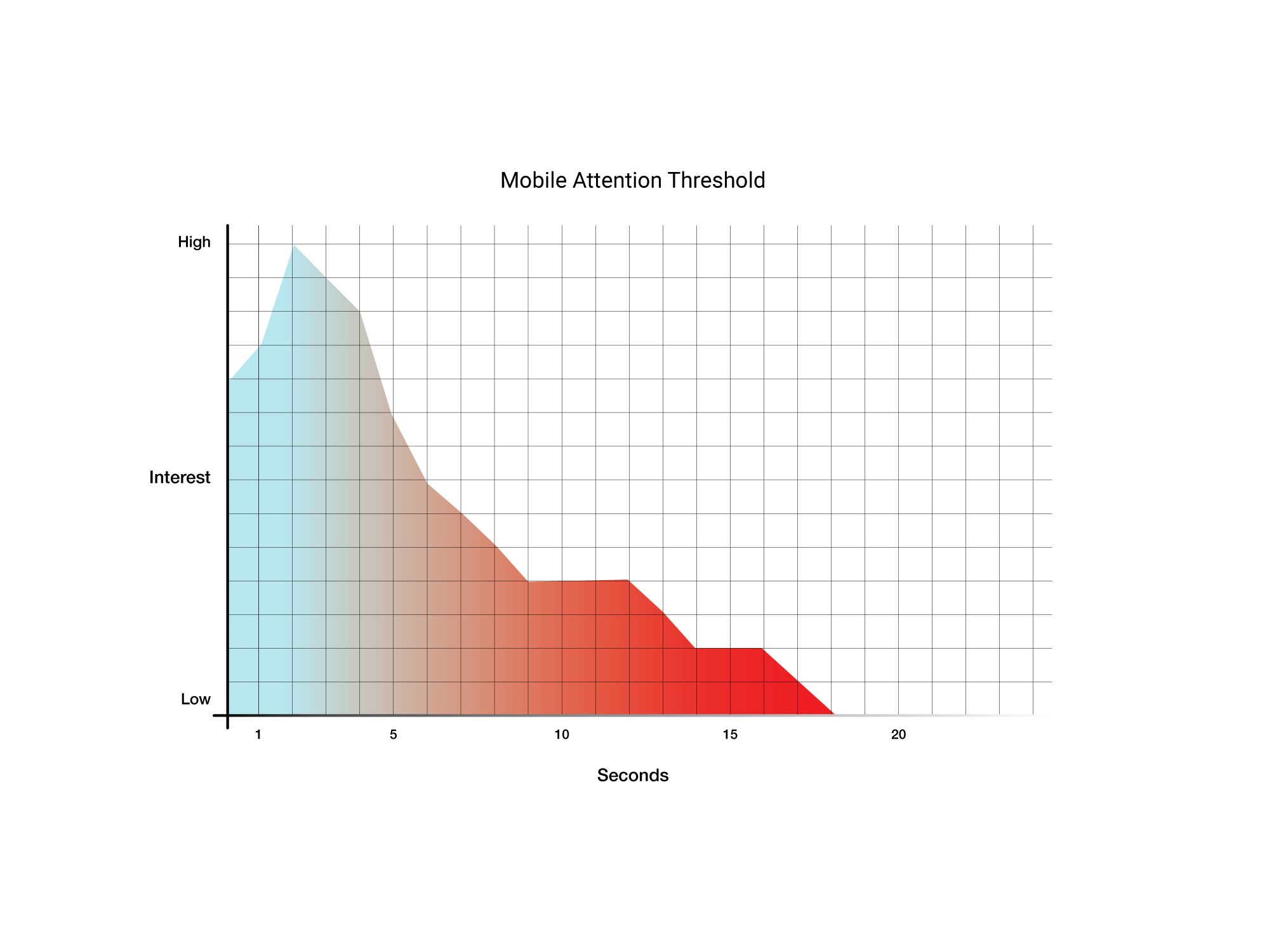
Slow Time-to-Tap
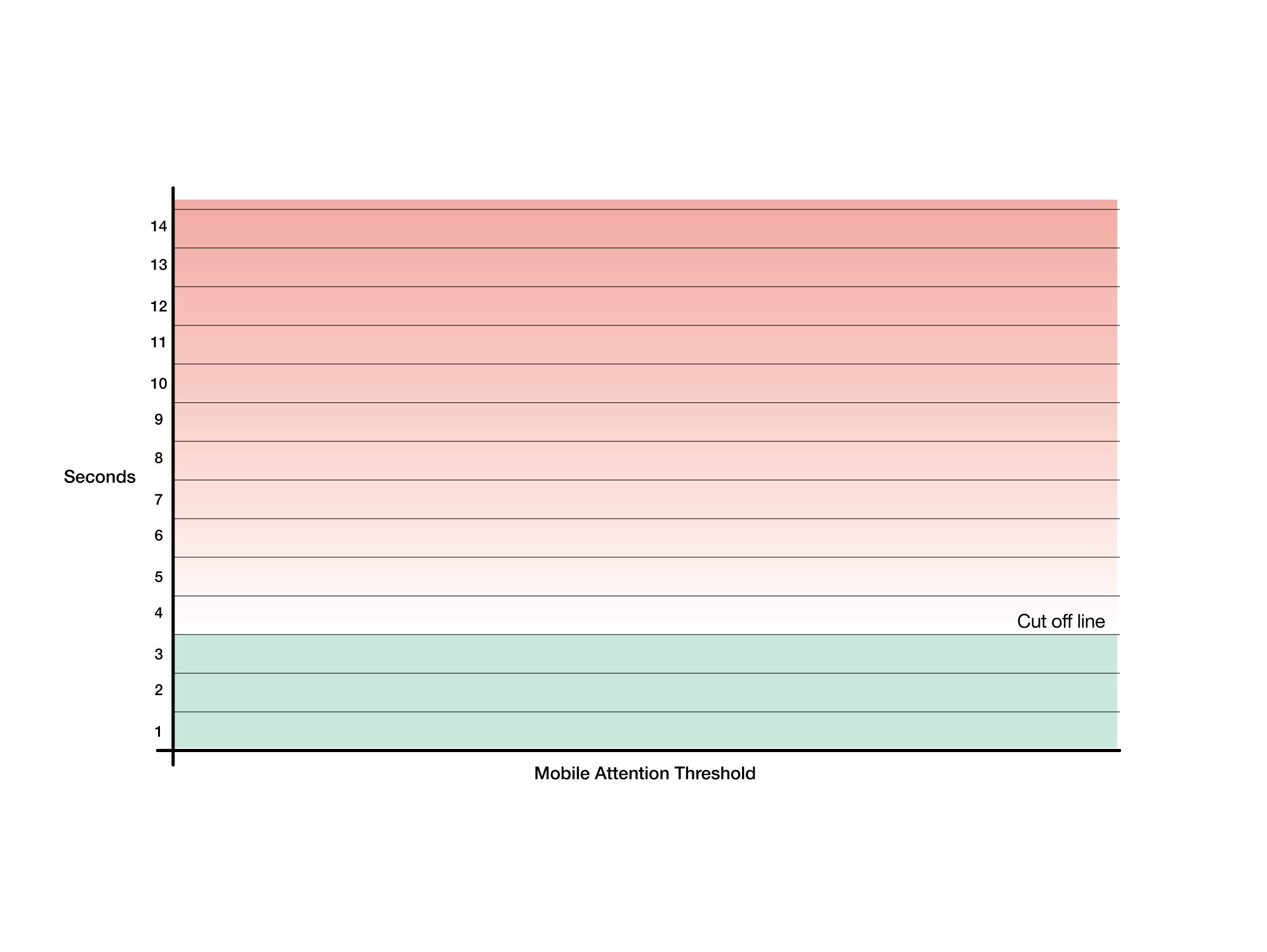
Overloaded hierarchy resulted in 10–15s time-to-tap, well over the 3-second standard threshold and contributing to the 53% mobile website abandonment rate.
Early Abandonment Risk
Mobile friction across the admissions pages created a P0-P2 level risk of prospective families abandoning the journey. Complex mobile flows typically see abandonment rates exceeding 50%.
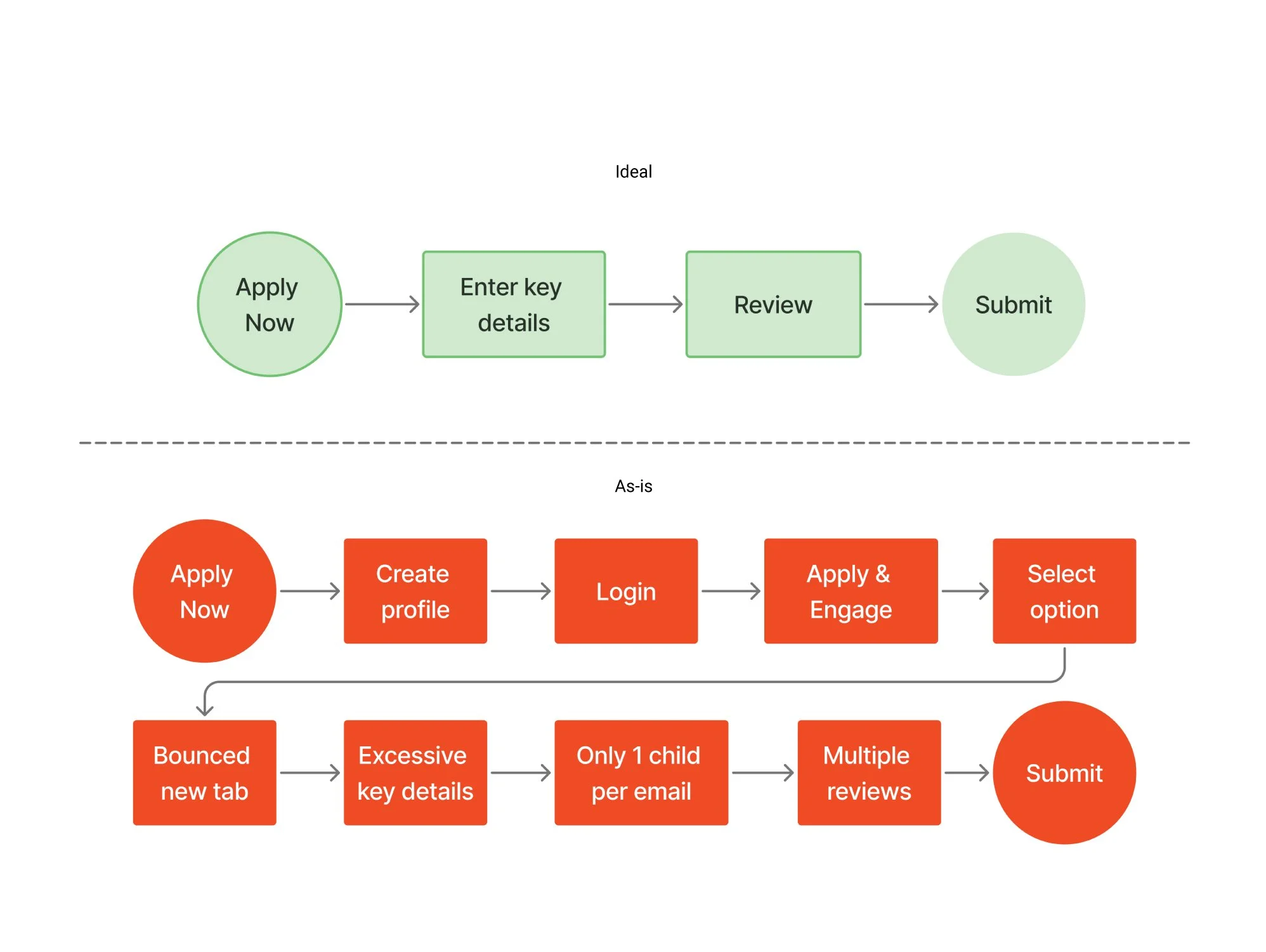
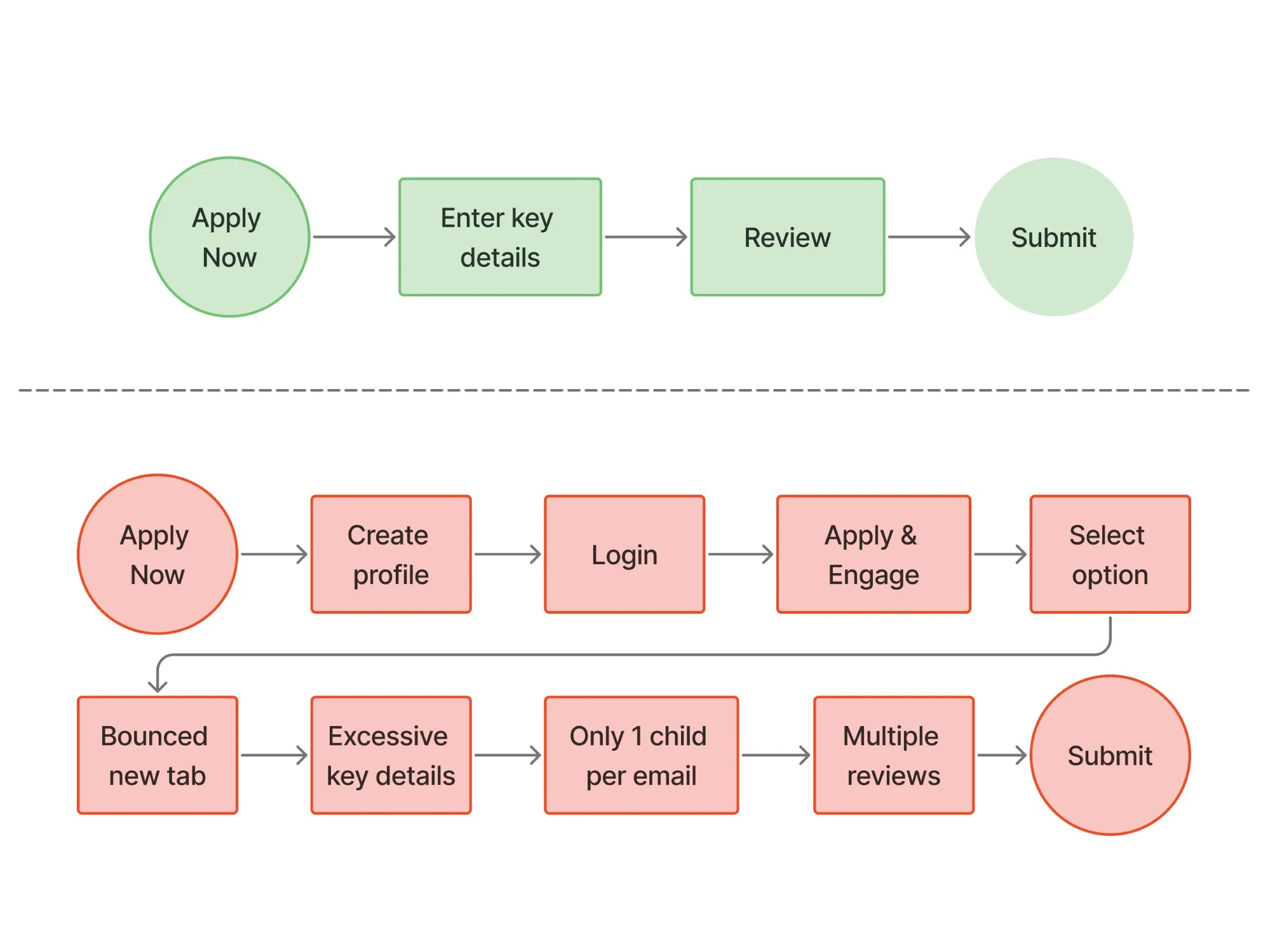
Excessive Tap-to-Task
Primary admissions actions required 6–10 taps (target ≤5-6). This excessive effort contributes significantly to the typical 53% mobile website abandonment rate when a site is too slow or complex

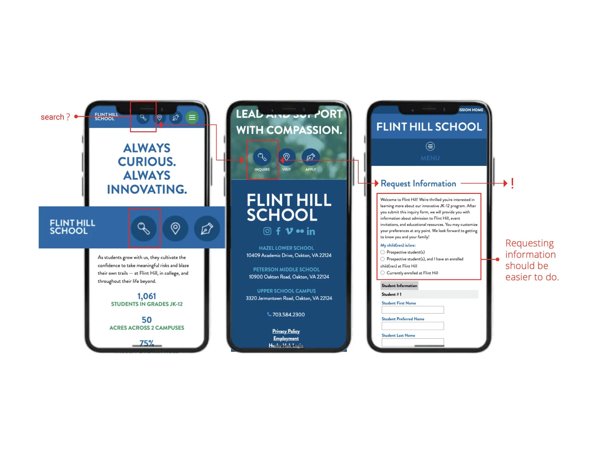
Ambiguous Nomenclature
Primary admissions actions were not framed around parent intent, increasing cognitive load and introducing hesitation at key decision moments.
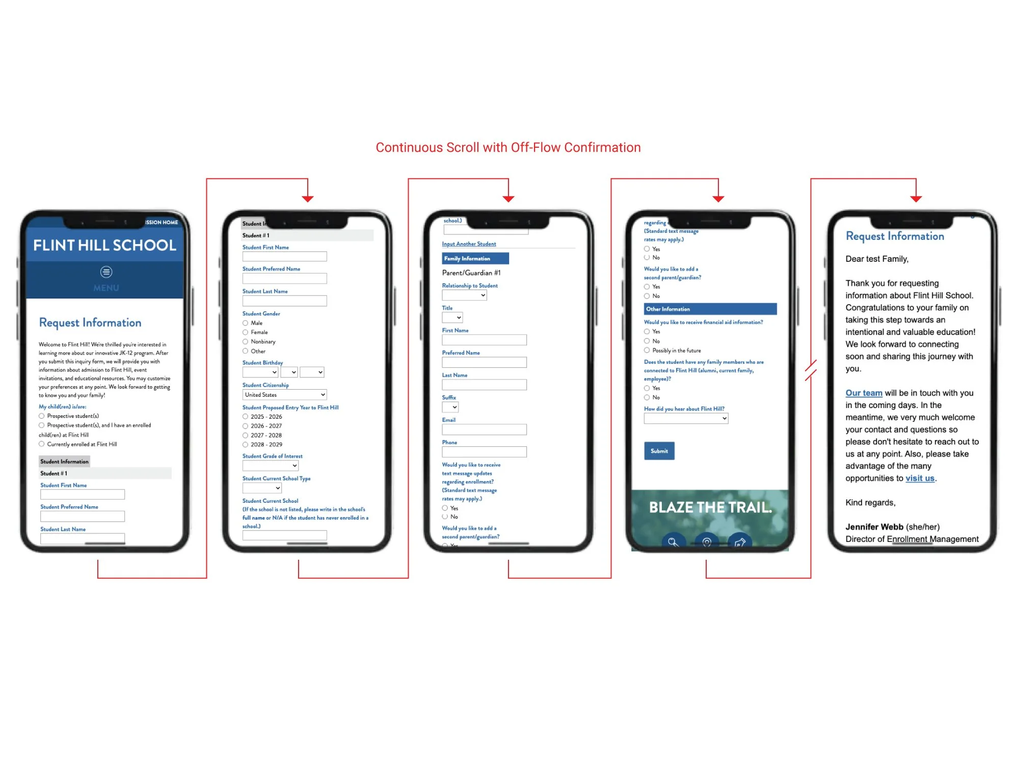
High Interaction Load
Unsegmented content and accordion-heavy structures increased interaction load, slowing task completion across all four admissions flows on mobile.
How Individual Failures Became Systemic
While each issue appeared distinct on the surface, together they revealed a deeper structural breakdown in how the admissions journey was organized.
The issues surfaced across Admissions, Request Info, Visit, and Apply while varied in form, they shared a common underlying cause. The admissions experience functioned as a set of disconnected pages rather than a cohesive decision system. High-severity blockers, navigation ambiguity, elevated interaction load, and delayed time-to-tap were not isolated defects, but repeated expressions of misaligned hierarchy, unclear pathfinding, and inconsistent CTA logic across the journey.
Propose Mobile Admissions Decision System
EST — 001 ARCHITECTURE REBUILD
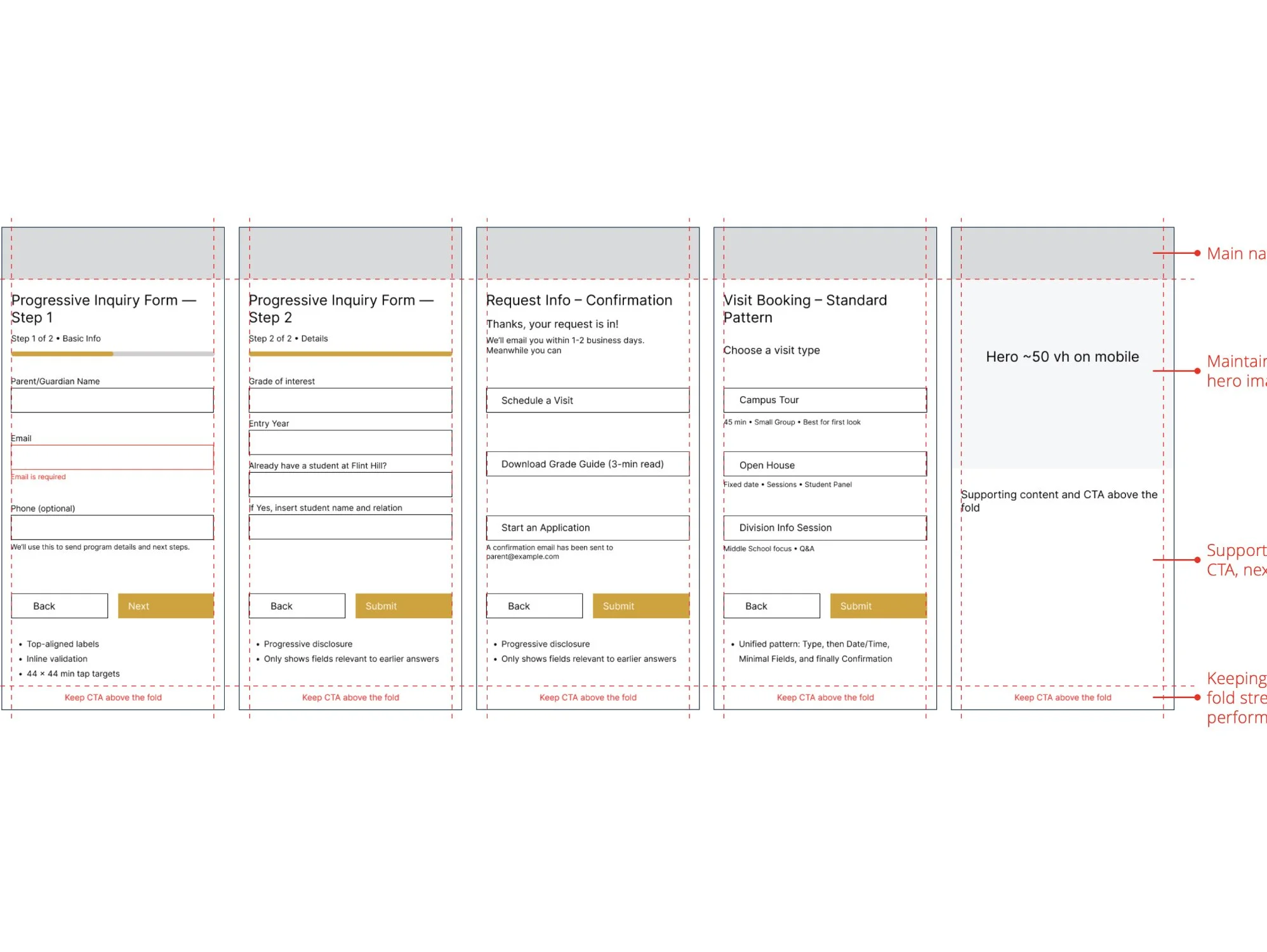
Addressing these issues required more than page-level adjustments. The solution lies in reestablishing a clear decision architecture that aligns intent, hierarchy, and action across the admissions journey. A target-state decision architecture that connects Admissions, Request Info, Visit, and Apply into a single, mobile-first flow.
This model describes a target mobile decision stem, not page-by-page Ul. It aligns the four admissions pages to a single intent progression, sets thresholds for taps and time-to-task, and defines where CTAs, value propositions, and confirmations should live to reduce abandonment risk on mobile.
ADMISSIONS
ROLE:
Establish interest and orient families to Flint Hill
RULES:
Show primary value proposition and 1 primary CTA above 50vh;guide toward “Request Infor” at ≤2 taps
REQUEST INFO
ROLE:
Capture contact and intent with minimal friction
RULES:
Keep taps-to-task at ≤2, segment log forms into scannable blocks, and prevent off-flow confirmation screens
VISIT
ROLE:
Convert interest into an on-campus on virtual visit
RULES:
Maintain ≤2 taps from entry pointsKeep visit CTAs visible without deep scrollSeparate “learn more” from “schedule visit”
APPLY
ROLE:
Support high-intent families through application
RULES:
Preserve a clear, single primary CTAShow inline confirmation of key actions, and avoid sending users to unbranded or off-site flows
System Constraints
TAP BUDGET: ≤2 taps per key action
TIME - TO - TASK: ≤5s to primary CTA
HIERARCHY: CTAs above 50vh
CONSISTENCY: One primary CTA per page
INTERACTION LOAD: No deep accordion sticks
Admissions performance is governed by system constraints, not isolated page optimizations. In Flint Hill’s mobile experience, friction accumulated upstream , through excessive interaction load, delayed time-to-tap, and unclear decision cues, and before users reached high-intent actions. As with any constrained system, pressure concentrated at the narrowest points, amplifying abandonment risk and reducing downstream yield. Addressing these constraints requires architectural correction, not incremental page fixes.
What the System Enables — and What It Requires
When admissions is treated as a decision system, improvements compound—not only in usability metrics, but in behavioral predictability and operational clarity. The proposed admissions architecture creates the conditions for measurably improved mobile behavior—reducing time-to-tap by an estimated 50–66%, eliminating unnecessary steps across key actions, and lowering abandonment risk through clearer, more predictable pathways. By aligning Admissions, Request Info, Visit, and Apply into a single intent-driven system, the structure supports faster decision-making, fewer taps to completion, and a more reliable inquiry pipeline.
However, architectural clarity alone does not guarantee experience quality. To realize these gains, the system requires:
Content discipline
Clear, consistent, and action-oriented language aligned to user intent at each stage of the admissions journey. Without this, even optimized pathways introduce hesitation and misinterpretation.Technical execution aligned to intent
Mobile-first architecture depends on developers capable of implementing hierarchy, interaction patterns, and state management with precision. Inconsistent or legacy implementations risk reintroducing friction the system is designed to remove.Governance over iteration
The value of the system lies in its consistency over time. Without shared rules for CTA placement, hierarchy, and sequencing, improvements degrade as pages evolve independently.
This evaluation establishes the architectural foundation. Sustained impact depends on content strategy, technical rigor, and cross-team alignment to uphold it.
Future Opportunities & Governance
While this evaluation focused on four admissions-critical flows, the work also surfaced broader structural inconsistencies that fall outside the original scope. These observations are not presented as findings, but as signals of where governance, taxonomy, and architectural alignment may require attention as the site evolves.
Inconsistent page entry models
Some top-level navigation items route to dedicated landing pages, while others drop users directly into deep content. This inconsistency introduces orientation friction and weakens expectation-setting across the ecosystem.Uneven information architecture enforcement
Sections governed by different content patterns and ownership models behave differently despite occupying equal navigational weight, signaling a lack of shared architectural rules.Fragmented content and messaging standards
Tone, hierarchy, and narrative depth vary by section, suggesting content development occurs without a unified admissions taxonomy or editorial system.Design and development constraint misalignment
Platform and implementation decisions appear to limit mobile optimization consistency, increasing long-term UX debt and constraining scalable improvement.
This Impact Study focused on diagnosing architectural risk and defining a mobile-first decision system for admissions. A deeper walkthrough of page-level findings, heuristic scoring, competitive benchmarks, and supporting evidence is available in the full Case Study.